|
Listen to this article
|
In the dynamic realm of cricket, where the sport has transcended conventional boundaries with the advent of one-day and T20 formats, the ICC Cricket World Cup stands tall as one of the premier international sporting extravaganzas. While the tournament’s on-field action captures the hearts of millions, there exists another facet that often goes unnoticed — the iconic logos that symbolize each edition of the Cricket World Cup. You can install the application 4RaBet latest version 2024 and start to place your bets right now.
Originating in England in 1975, the inaugural Cricket World Cup marked a turning point in the sport’s global appeal. Over the years, the tournament has witnessed a metamorphosis, mirroring cricket’s evolution from traditional test matches to the electrifying one-day and T20 formats. Our exploration, however, pivots away from the cricketing battles and into the realm of design — the unique and captivating logos that have come to define each Cricket World Cup.
As we embark on this visual journey, we’ll delve into the historical tapestry of Cricket World Cup logos, tracing their evolution from the tournament’s nascent days in 1975 to the contemporary designs that encapsulate the spirit of this celebrated event. Join us as we unravel the stories behind these symbols and discover the intricate threads that weave together the visual narrative of the ICC Cricket World Cup.
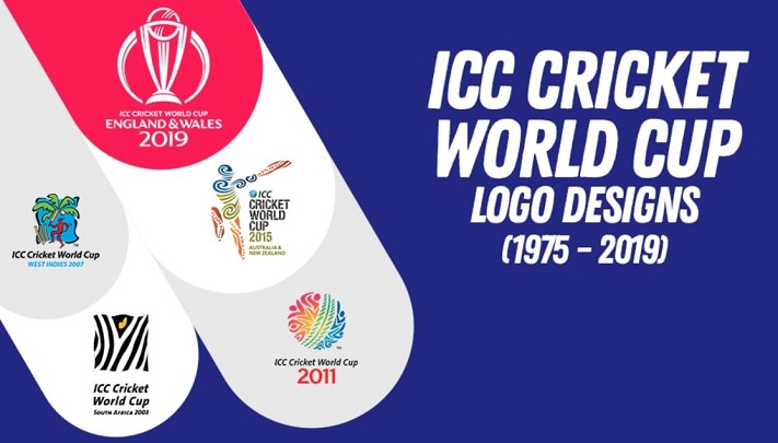
Over the almost half-century that the Cricket World Cup has existed (1975-2024), the design of the championship logo has changed several times:
| Years of changing | Logo | Host country |
| 1975, 1979 and 1983 | Prudential Cup | England |
| 1987 | Reliance Cup | India and Pakistan |
| 1992 | Benson & Hedges World Cup | Australia and New Zealand |
| 1996 | Wills World Cup | India, Pakistan and Sri Lanka |
| 1999 | ICC Cricket World Cup England | England |
| 2003 | ICC Cricket World Cup South Africa | England, South Africa, Zimbabwe, Kenya |
| 2007 | ICC Cricket World Cup West Indies | West Indies |
| 2011 | ICC Cricket World Cup | India, Sri Lanka and Bangladesh |
| 2015 | ICC Cricket World Cup | Australia, New Zealand |
| 2019 | ICC Cricket World Cup | England |
| 2023 | ICC Cricket World Cup | India |
Cricket World Cup Logo At 1975, 1979 And 1983 Years
Sponsored by the Prudential Assurance Company and organized by the International Cricket Conference, the inaugural logo was a testament to simplicity and symbolism.
1975 Cricket World Cup Logo
The genesis of the ICC Cricket World Cup in 1975 not only marked the commencement of a prestigious tournament but also introduced the world to a distinctive logo.
The design featured a classic world globe, a universally recognized symbol, with a notable twist — the traditional red cricket ball was ingeniously positioned at the heart of the globe. Below this iconic representation, the year of the tournament was proudly displayed, encapsulated within a timeless design. A thick black baseline provided a sturdy foundation for the logo, adding a touch of bold elegance. The semi-meridian mounting, also in a striking black hue, further accentuated the logo’s prominence.
This emblematic design, known as the “Prudential Cup,” not only captured the spirit of cricket’s global reach but also laid the foundation for future iterations of Cricket World Cup logos.
1979 Cricket World Cup Logo
The 1979 Cricket World Cup maintained continuity in its logo design, adhering to the timeless visual identity established in the inaugural edition. The Prudential Cup logo persisted, with the only notable alteration being the update of the year to reflect the ongoing tournament.
Held in England from June 9 to June 23, the 1979 Cricket World Cup featured the same symbolic globe adorned with a red cricket ball, encapsulated by the year of the event. The robust black baseline and semi-meridian mounting remained unchanged, preserving the classic appeal that had become synonymous with the tournament’s visual representation.
As cricket enthusiasts witnessed thrilling encounters on the field, the familiar Prudential Cup logo served as a constant emblem, reinforcing the global unity and competitive spirit inherent in the Cricket World Cup.
1983 Cricket World Cup Logo
The 1983 Cricket World Cup marked a pivotal moment in the tournament’s history, as it ventured beyond the shores of England to India and Pakistan. Amidst the cricketing excitement, the logo retained its familiar Prudential Cup design, with a significant update — the transition to a new year, signifying the continuation of a storied tradition.
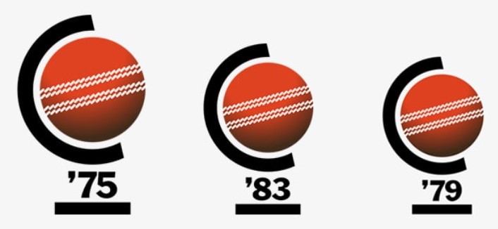
While the iconic globe and cricket ball motif remained unchanged, the bold black baseline and semi-meridian mounting continued to provide a sturdy framework for the emblematic design. The 1983 Cricket World Cup, held from June 9 to June 25, unfolded with the same visual continuity, reinforcing the enduring legacy of the tournament’s symbolic representation.
As cricket aficionados celebrated the sport’s expanding horizons, the Prudential Cup logo stood as a timeless emblem, paving the way for the triumphs and innovations that would define the future of the ICC Cricket World Cup.
Cricket World Cup Logo At 1987
In 1987, the ICC Cricket World Cup witnessed an evolution in its visual identity, departing from the familiar Prudential Cup emblem that had graced the tournament since its inception. Sponsored once again by the Prudential Assurance Company and organized by the International Cricket Conference, the logo underwent a transformation that reflected the changing dynamics of the cricketing world.
The 1987 Cricket World Cup, hosted jointly by India and Pakistan, introduced a new design that departed from the classic globe-and-ball motif. In its place emerged a dynamic logo that embraced a contemporary aesthetic while preserving the essence of the sport. The emblem featured a stylized cricket bat striking a cricket ball, encapsulated within a sleek and modern design.
Gone was the traditional globe, replaced by a symbol that resonated with the dynamic and evolving nature of cricket. The year of the tournament was elegantly integrated into the logo, maintaining the tradition of highlighting the event’s timeline. The color palette remained bold and vibrant, underscoring the energy and excitement of the Cricket World Cup.
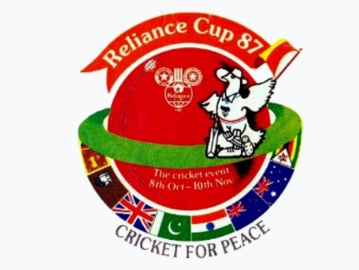
As cricket enthusiasts tuned in to witness the spectacle of the 1987 tournament, the new logo symbolized a fresh chapter in the history of the ICC Cricket World Cup. The departure from the Prudential Cup design signaled a willingness to embrace change and innovation, setting the stage for a visually captivating journey through the subsequent editions of this global cricketing extravaganza.
Cricket World Cup Logo At 1992
The dawn of the 1990s brought with it an era characterized by simplicity and elegance, a sentiment artfully encapsulated in the design of the logo for the 1992 ICC Cricket World Cup. Held from February 22 to March 25 across New Zealand and Australia, this fifth edition of the tournament bore the sponsorship of the British brand ‘Benson & Hedges,’ with the International Cricket Council orchestrating the cricketing spectacle.
Dubbed the “Hedges World Cup,” the logo of the 1992 edition deviated from intricate designs, opting instead for a refined and straightforward aesthetic. In the spirit of the times, the creators aimed for a design that not only embodied simplicity but exuded an unmistakable sense of elegance.
Upon close inspection of the logo, a subtle yet captivating representation of the tropical nature of Australian and New Zealand territories unfolds. The intentional inclusion of these elements served as a subconscious nod to the host nations of the 1992 World Cup, adding a layer of geographical significance to the design.
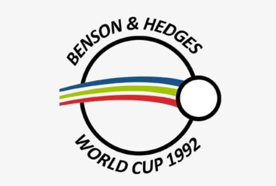
What set this cricket team logo design apart was its ability to seamlessly translate onto the World Cup jerseys. The clean lines and harmonious composition made the emblem not only visually appealing but also a perfect fit for the vibrant and dynamic atmosphere of the tournament. As cricket enthusiasts witnessed the battles on the field during the 1992 Cricket World Cup, the Hedges World Cup logo stood as a testament to the artistry of simplicity, leaving an indelible mark on the visual legacy of this iconic sporting event.
Cricket World Cup Logo At 1996
The 1996 ICC Cricket World Cup, the sixth edition of the tournament, unfolded as a vibrant celebration of cricket, hosted by India, Pakistan, and Sri Lanka. Sponsored by ITC’s Wills brand and organized by the International Cricket Council, this multi-nation event took place from February 14 to March 17, captivating cricket enthusiasts across borders.
At the heart of this edition’s visual identity was the “Wills World Cup” logo — a design that not only symbolized the spirit of cricket but also paid homage to the amalgamation of cultures and colors from the host nations. Dominated by a dynamic image of a batsman in action, the logo seamlessly blended the distinctive hues associated with India, Pakistan, and Sri Lanka, creating a visual tapestry that echoed the unity of nations on the cricketing stage.
The sponsored name, ‘Wills,’ found its place in a striking red rectangular box, a bold element that added a touch of modernity to the design. Beneath it, the year of the tournament was proudly displayed, linking the emblem to the specific edition of the World Cup. Notably, a red thick line traversed the logo, cleverly representing the cricket pitch—a symbolic element that underscored the essence of the sport.
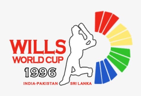
As cricket enthusiasts immersed themselves in the excitement of the 1996 Cricket World Cup, the Wills World Cup logo stood as a testament to the dynamic fusion of cricketing prowess and cultural diversity. This emblem not only adorned the jerseys of competing teams but also became a visual anthem, echoing the harmonious collaboration of nations in the pursuit of cricketing glory.
Cricket World Cup Logo At 1999
The 1999 ICC Cricket World Cup marked a significant shift in the tournament’s dynamics, as the International Cricket Council expanded its role, steering the event with a broader vision. This transformation was mirrored in the logo design, breaking away from the previous batsman-centric imagery and introducing a dynamic representation of a bowler. What makes this design even more intriguing is its embodiment of Indian fast bowler ‘Debashish Mohanty.’
Known for his distinctive tall and slim stature, as well as his skillful bowling, Mohanty’s image found its way into the heart of the Cricket World Cup England logo. The designers, inspired by Mohanty’s fast bowling movements, skillfully captured his actions with expressive brush strokes, creating a visually captivating representation.
In a departure from monochromatic designs of the past, the logo embraced a vibrant spectrum of colors. These hues weren’t merely aesthetic choices; they symbolized the diversity inherent in the Cricket World Cup — a gathering of cricketing talents from around the globe. The multicolored palette became a visual metaphor for the unity of nations and players in the pursuit of excellence on the cricket field.
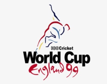
The simplicity and modernity infused into the logo captivated audiences worldwide. Beyond being a mere emblem, it became a symbol of the evolving nature of cricket, reflecting the diverse skill sets and talents converging on the grand stage of the 1999 Cricket World Cup. As cricket aficionados witnessed the tournament unfold in England, the logo stood as a testament to the sport’s ability to break boundaries and celebrate the richness of its global tapestry.
Cricket World Cup Logo At 2003
The eighth installment of the Cricket World Cup in 2003 unfolded as a momentous event hosted by South Africa, Kenya, and Zimbabwe from February 9 to March 23. Notably, South Africa took on the role of a host for the first time, setting the stage for cricketing excellence and unexpected twists on the African continent.
As cricket enthusiasts eagerly awaited the unfolding drama on the field, the visual identity of the tournament, encapsulated in the “Cricket World Cup South Africa” logo, offered a captivating preview. The designers chose to weave a unique narrative into the emblem, departing from conventional representations. Zebra stripes, synonymous with the African landscape, dominated the design, creating a striking visual impact.
In addition to the zebra stripes, a vibrant yellow flame emerged as a prominent feature, adding an element of dynamism to the logo. Together, these elements seamlessly conveyed the essence of the African continent, celebrating the fusion of black and white cultures and the rich cultural diversity of South Africa.

Beyond being a mere symbol, the 2003 World Cup logo became a visual tapestry that reflected the harmonious coexistence of diverse peoples and cultures. It served as a testament to the transformative power of cricket, bringing nations together on the field and celebrating the unity that transcends borders. As teams competed for glory, the logo stood as a beacon, reminding the world of the beauty inherent in the intersection of sports, culture, and diversity.
Cricket World Cup Logo At 2007
The stage was set in the vibrant and sun-soaked locales of the West Indies for the 2007 Cricket World Cup, which unfolded from March 13 to April 28. Unlike its predecessors, the logo for this edition transcended mere representation; it became a rich tapestry of symbolism, capturing the essence of Caribbean life and resonating with an international audience.
Drenched in symbolism and spirit, the “Cricket World Cup West Indies” logo served as a visual anthem for the tournament. At its heart stood a dynamic red figure in motion — a symbolic representation of the passion and energy that cricket stirred within the hearts of players and fans alike.
Surrounding this central figure, the logo artfully incorporated elements that celebrated Caribbean life. Palm tree leaves, gently swaying in the tropical breeze, evoked the laid-back yet vibrant atmosphere of the islands. The blue surroundings served as a visual tribute to the azure Caribbean Sea that cradled these cricketing nations.
Embedded within this vibrant tableau were the quintessential symbols of cricket — the stumps, bat, and ball — testifying to the universal language spoken on the cricket field. This amalgamation of elements, each laden with meaning, beautifully encapsulated both the unique character of the Caribbean and the timeless spirit of cricket.
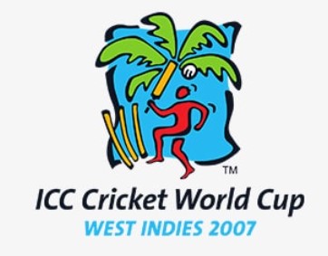
As the 2007 Cricket World Cup unfolded, the logo transcended its role as a mere symbol; it became a visual journey through the heart and soul of the West Indies, resonating with cricket enthusiasts worldwide. In each stroke and curve, the logo whispered tales of passion, camaraderie, and the universal love for the game that reverberated across the Caribbean islands and beyond.
Cricket World Cup Logo At 2011
The tenth edition of the ICC World Cup in 2011 unfolded as a grand cricketing spectacle hosted by India, Sri Lanka, and Bangladesh from February 19 to April 2. What makes this edition’s logo particularly fascinating is the collaborative effort that went into its creation. Cricket authorities reached out to companies worldwide, inviting them to submit their logo designs. Out of twelve submissions from across the globe, the design crafted by the Australian creative firm Witekite emerged victorious, etching its mark on the visual legacy of the tournament.
The logo itself takes the form of a cricket ball, embodying the very essence of the sport. Positioned in an upright joint, the green-hued ball becomes a symbol of unity, where the fervor of cricket transcends borders. On either side of this central joint, expressions of cheering crowds unfold, embodying the collective passion and spirit of fans cheering for their respective teams.
The strategic use of red and blue colors within the logo serves a dual purpose—it represents the fourteen playing nations, each contributing its unique hue to the vibrant mosaic. Simultaneously, the colors evoke a festive atmosphere, symbolizing the joy and celebration inherent in the grand cricketing bonanza unfolding in the subcontinent.
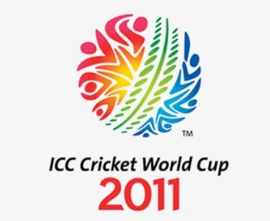
As the logo was unveiled in July 2009 during an official ceremony in Mumbai, it became more than just a visual representation; it became a testament to the global unity and celebration that cricket brings. A colorful embodiment of action, movement, and camaraderie, the 2011 Cricket World Cup logo mirrored the best aspects of cricket, captivating players and fans alike as they embarked on a journey through the heart of the subcontinent’s cricketing passion.
Cricket World Cup Logo At 2015
The 2015 ICC Cricket World Cup, jointly hosted by Australia and New Zealand, unfolded as a cricketing spectacle from February 14 to March 29. Just as in previous editions, the tournament’s visual identity took center stage, with authorities inviting companies worldwide to submit their designs. In parallel to the 2011 World Cup, an Australian graphic consultancy’s design was chosen, further solidifying the nation’s creative imprint on cricket’s visual landscape.
The “Cricket World Cup Australia” logo, however, went beyond a mere representation of the tournament; it became a canvas that artfully blended the cultural influences of both host countries, Australia and New Zealand. The designers, with a deft touch, incorporated Maori and Aboriginal motifs into the artwork, creating a harmonious tapestry that celebrated the unique cultures of the two nations.
At the heart of the design stood a batsman playing a masterstroke — a powerful image that transcended cricketing boundaries and resonated with the universal language of the sport. The logo radiated a sense of celebration and unity, encapsulating the joyous spirit that accompanies cricket’s grandest spectacle.
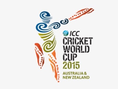
Haroon Lorgat, the ICC Chief Executive at the time, lauded the logo as “a dynamic logo which captures the cultural influences in the two host countries.” Beyond being a mere emblem, the 2015 Cricket World Cup logo became a symbol of the inclusive and celebratory nature of the tournament, inviting fans from across the globe to partake in the shared joy of cricket. As the tournament unfolded, the logo stood as a beacon, symbolizing the cultural richness and unity that define the cricketing community.
Cricket World Cup Logo In 2019
The anticipation for the ICC Cricket World Cup reached a crescendo in 2019 as fans from around the world eagerly awaited the 12th edition of the tournament, set to unfold in England and Wales. The tournament, scheduled to commence on May 30, carried with it the promise of thrilling cricketing action and global unity. At the heart of this edition’s visual identity stood the emblematic “Cricket World Cup England & Wales” logo — a design that seamlessly blended elegance with tradition.
Breaking away from previous editions, the logo took the shape of the revered World Cup Trophy itself, symbolizing the pinnacle of cricketing achievement. The trophy, rendered in a striking combination of grey and pink, exuded a sense of both prestige and modernity. Just below this iconic design, the names of the governing body and the host countries were proudly displayed, anchoring the emblem in the rich tapestry of cricketing heritage.
The 2019 Cricket World Cup logo was unveiled against the backdrop of significant changes in the tournament’s format, featuring just 10 teams — a departure from previous editions. This alteration heightened the anticipation and competition, emphasizing the intensity of each encounter.
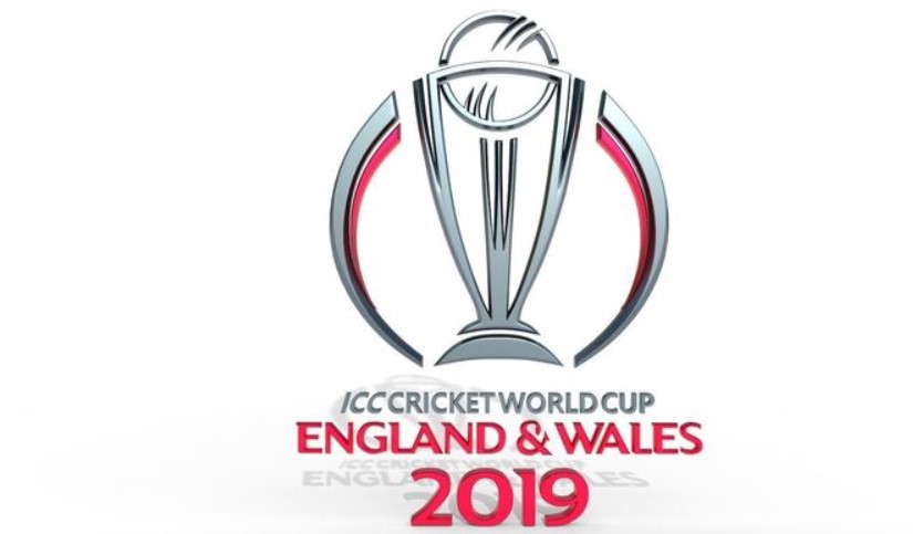
As cricket enthusiasts prepared to witness the battles unfold on English and Welsh grounds, the logo served as a visual ambassador, embodying the grace, tradition, and excitement that define the essence of the Cricket World Cup. In its simplicity and elegance, the logo became a symbol of the sport’s enduring spirit, uniting fans worldwide in celebration of the grand spectacle that is the ICC Cricket World Cup.
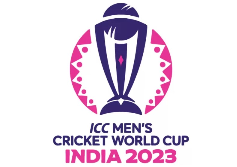
Cricket World Cup Logo In 2023
As the cricketing world gears up for the 2023 ICC Men’s Cricket World Cup, the International Cricket Council (ICC) unveils a brand identity that transcends the boundaries of sport and taps into the universal language of human emotions. This edition, commemorating the 12th anniversary of India’s triumph at the ICC Men’s Cricket World Cup 2011, promises to be the biggest cricketing spectacle ever, featuring 10 teams and 48 matches.
At the heart of the 2023 Cricket World Cup brand is the concept of ‘Navarasa’ — the nine emotions that audiences experience during a performance. In a pioneering move, these emotions have been reimagined in the context of cricket, using symbols and colors that depict the myriad feelings fans undergo while witnessing the drama and excitement of a World Cup cricket match.
The ‘Navarasa’ of the CWC23 comprises joy, power, anguish, respect, pride, bravery, glory, wonder, and passion. These emotions are a testament to the rich history of the Men’s Cricket World Cup, evoking the various reactions and sentiments that resonate with cricket enthusiasts worldwide.
To showcase the ‘Navarasa,’ a bespoke vignette, narrated by the legendary Indian commentator Harsha Bhogle, has been produced. This visual and auditory representation captures the essence of the emotional rollercoaster that is the Men’s Cricket World Cup, celebrating the highs and lows, the triumphs and challenges that define the tournament.
In a special event in Chennai, the ICC’s digital collectible partner FanCraze commemorates the 12-year milestone by gifting MS Dhoni a Navarasa-themed ‘glory’ Digital Collectible. This collectible, highlighting Dhoni’s iconic six from the Men’s Cricket World Cup final in 2011, serves as a tribute to one of the greatest moments in Indian cricket history. Soon, fans will have the opportunity to purchase this digital collectible, allowing them to own a piece of cricketing glory.
As the countdown to the 2023 Cricket World Cup continues, the ICC’s digital channels will release iconic cricketing moments every week, each related to one of the remaining eight emotions. This innovative approach builds anticipation for the global showpiece, promising not only thrilling cricketing action but also a celebration of the myriad emotions that make the Men’s Cricket World Cup a truly unforgettable experience for fans worldwide.
Conclusion
In the captivating journey through the evolution of Cricket World Cup logos, we traverse a visual timeline that mirrors the transformation of the sport itself. From the inaugural design in 1975, where the globe and cricket ball intertwined, to the innovative and culturally rich logos of recent years, each emblem tells a story of cricket’s global growth, cultural resonance, and the changing dynamics of the tournament. The logos are not mere symbols; they encapsulate the spirit of each edition, becoming a visual bridge connecting cricket enthusiasts across nations and generations.
As we bid adieu to the diverse array of logos that have graced the Cricket World Cup stage, we witness more than just a shift in design trends. We witness the evolution of cricket as a global phenomenon, transcending boundaries and resonating with the emotions and cultures of millions. From the simplicity of the early logos to the intricate symbolism of recent editions, the Cricket World Cup logos serve as visual markers of the tournament’s journey—one that unites cricketing nations in the pursuit of excellence and echoes the emotions of joy, pride, passion, and wonder that define the world’s most celebrated cricketing spectacle.
Evolution Of Cricket World Cup Logo Designs (1975 to 2023) Video
FAQ
Which country hosted the first Cricket World Cup in 1975?
England hosted the first Cricket World Cup in 1975.
What iconic symbol was incorporated into the design of the 1975 Cricket World Cup logo?
The 1975 logo featured a classic world globe with a red cricket ball at its center.
Which company sponsored the 1975 Cricket World Cup?
The first Cricket World Cup was sponsored by the Prudential Assurance Company.
In what year did the Cricket World Cup logo transition from featuring a batsman to a bowler?
The change occurred in the 1999 Cricket World Cup logo.
What unique design elements were incorporated into the 1987 Cricket World Cup logo?
The logo featured zebra stripes along with a yellow flame.
What distinctive feature characterized the 1996 Cricket World Cup logo?
The 1996 logo had a batsman in a cricketing pose with colors representing the participating nations.
How did the 2003 Cricket World Cup logo symbolize the host continent?
The logo featured zebra stripes and a yellow flame, subtly representing Africa.
Which creative firm from Australia designed the logo for the 2011 Cricket World Cup?
The design was crafted by the Australian creative firm Witekite.
What cultural motifs were incorporated into the 2015 Cricket World Cup logo?
The logo featured Maori and Aboriginal motifs representing Australian and New Zealand cultures.
What significant change in format was introduced in the 2019 Cricket World Cup?
The 2019 World Cup featured just 10 teams, a departure from previous editions.
How did the 2019 Cricket World Cup logo honor India’s triumph in 2011?
The logo paid homage to India’s victory by incorporating the trophy design.
What unique concept was at the core of the 2023 Cricket World Cup brand identity?
The central theme was ‘Navarasa,’ representing the nine emotions experienced during a performance.

Satish, a prolific author hailing from India, has become a prominent figure in the world of online sports betting. With a deep passion for both sports and data analysis, he has carved out a niche for himself as a trusted source of information and insights in the ever-evolving landscape of sports betting.
Satish’s articles are known for their in-depth analysis, statistical rigor, and keen eye for emerging trends, making him a sought-after authority in the field. His work not only informs but also empowers sports enthusiasts and bettors, providing them with valuable knowledge to make informed decisions in the world of online sports wagering.